data

Chart marker
WHAT The chart marker pattern uses charts to enrich aggregated data or to visualize a second attribute of clustered data. Adding tiny charts to the map is a powerful visualization technique to communicate additional aspects of the data. WHY It’s easy to symbolize a single observation through color, shape, or size, but as soon as […]
Read More
Choropleth map
WHAT Visualize how a measurement varies across a geographic area. WHY Choropleth maps provide an easy way to visualize how a measurement varies across a geographic area or show the level of variability within a region. WHEN Choropleth maps are important to support analysis across pre-defined geographic area, e.g. an election map divided by electoral […]
Read More
Data extract
WHAT Extract geographic data for a specific region. WHY A common service for a spatial portal is to deliver data to a user. Data may be vector features (points, lines, polygons) or raster imagery. Data can be raw or processed and depending on the selected region encompass any combination of above, i.e. multiple layers. WHEN User needs to acquire […]
Read More
Cluster marker
WHAT The cluster marker pattern is a common method to avoid visual clutter by grouping points together, and many apps that display point data benefit from this pattern. Cluster marker differentiates overlapping features that are difficult to distinguish and interact with. WHY Data layers can have any number of point features, and it is almost […]
Read More
Spatial filter
WHAT The spatial filter pattern reduces available features by selecting a specific geographic region or area of interest. WHY Location, location, location is not only the mantra in real estate but also true for most consumer apps in which location is what people care about the most. This location can be a place or any […]
Read More
Attribute filter
WHAT The attribute filter pattern reduces large datasets into more meaningful and manageable selections based on attribute criteria. WHY Filters are omnipresent in modern apps and, like search, are the most important mechanism to find the data that best suits a user’s needs. Search aims at finding a particular place, object, or group of objects […]
Read More
Data dimming
WHAT The map contains too many features so that it is difficult to identify them, distinguish them, pick out relationships, see patterns in the distribution. WHY The same location might be occupied by multiple features of different types and therefore visually obscure their existence. Data Dimming helps highlighting related features that are otherwise difficult to […]
Read More
Extent-driven content
WHAT The extent-driven content pattern synchronizes content in the UI with the map extent. It describes how the map can be used as a dynamic spatial filter that updates other content on the page as the map extent changes. WHY Data can be visualized in many ways. The most common visualization components are charts, tables, […]
Read More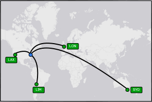
Flow map
WHAT Data visualization with straight or geodesic lines have visual limitations. WHY Studying and analyzing relationships between objects is a common task. Visualizing existing, missing or broken connections is important to understand patterns or issues. Common approaches for dynamic flow mapping include using straight lines and geodesic lines, both of which have immediate visual limitations. […]
Read More
Data-ink ratio
WHAT The data-ink ratio pattern relates to the amount of ink used to provide useful information. It compares the amount of data versus the amount of ink, or pixels, used in the display. A well-designed app should aim for a high ratio of relevant to irrelevant information, or a high ratio of data to ink. […]
Read More